Three things that should be designed specifically for visitors
Signage
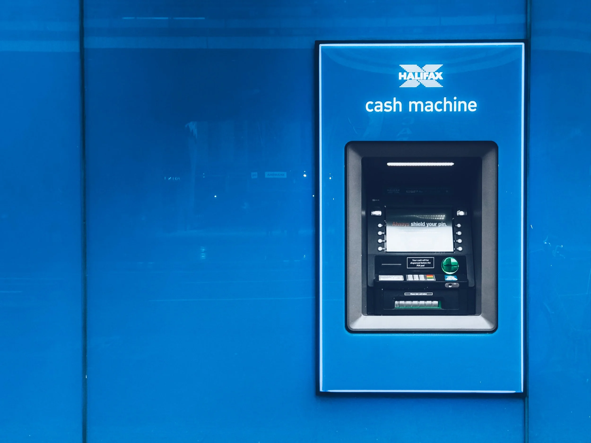
Remember this rule when it comes to your interior and exterior signs: It’s always someone’s first Sunday. Regular attendees know where everything is and what everything is. But new attendees do not. Your signs should be designed for first timers. You can have branded names for ministry areas but make sure the signage also has clear terms with clear terms like “elementary children’s worship” or “infant nursery.”
Bulletin
I’ve always found that regular attendees scan bulletin but guests examine it thoroughly. So make it both informative and orienting. Click here for some great resources on church bulletins.
Website
I’ve found that our church family connects to our social media but guests connect with our website first. Therefore, your website should be designed as an invite tool rather than a communication tool of church happenings. Click here to download a checklist of what should be on your website.


